ALFAPAK POWERHOUSE
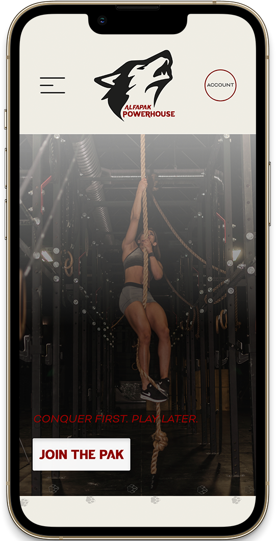
CONQUER FIRST. PLAY LATER.
AlfaPak Powerhouse is a gym based out of New Orleans, LA. I created this mobile forward app and rebranded it from the original logo and identity. The app, brand marks, icons and logo are all newly designed. AlfaPak's mascot and overall inspiration is derived from wolves. Member's of the Pak will experience a family enviorment, surrounded by plenty of people who strive to improve mentally and physically, while eventually molding into a strong leader.
In- App Teasers
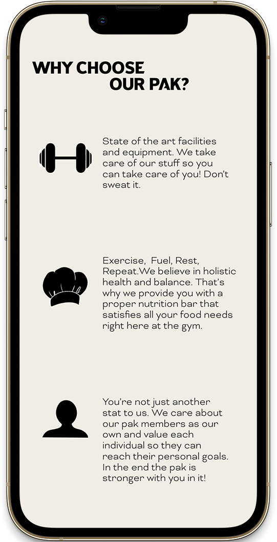
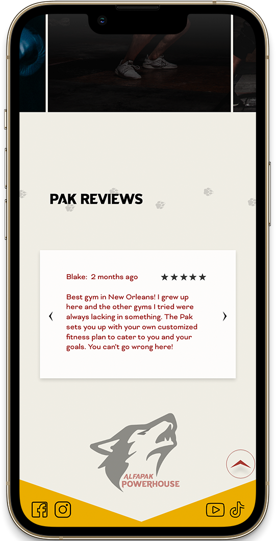
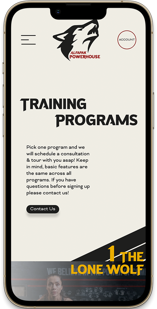
Why Should you Choose AlfaPak?
State of the art facilities and equipment. We take care of our stuff so you can take care of you! Don’t sweat it.
Exercise, Fuel, Rest, Repeat. We believe in holistic health and balance. That’s why we provide you with a proper nutrition bar that satisfies all your food needs right here at the gym.
You’re not just another stat to us. We care about our pak members as our own and value each individual so they can reach their personal goals. In the end the pak is stronger with you in it!
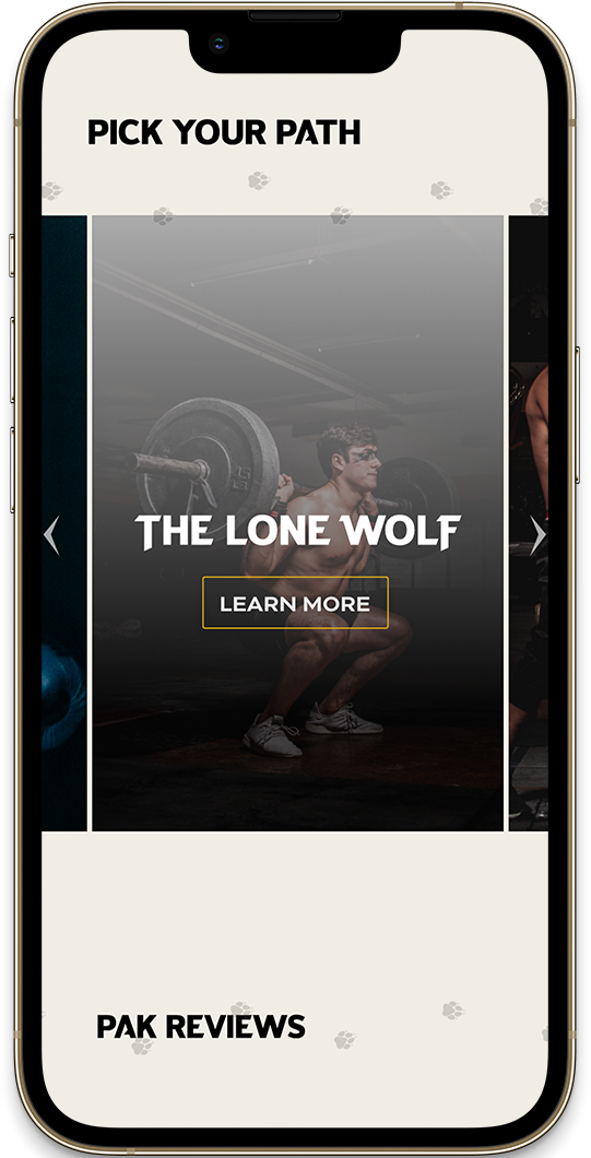
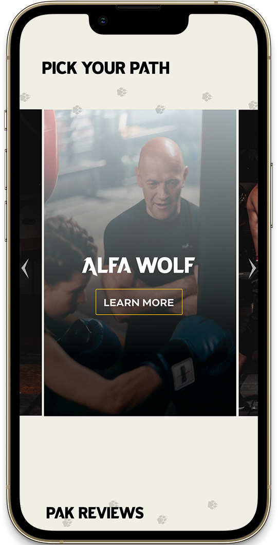
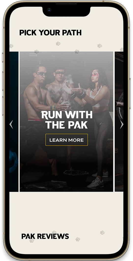
Explore the App!
New v.s. Old

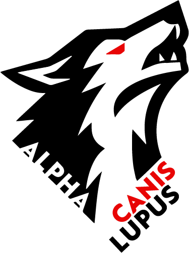
The old logo consisted of sharp marks and rough edges and high contrast. The typography was also a bit hidden and long, which could make it harder to read when sized smaller on a mobile screen. For the rebrand, we decided that changing the name of the gym itself was important as well. The original logo "Alpha Canis Lupus", wasn't quite catchy and wasn't connecting to our audience as well as we had liked. However, we felt it was crucial that we kept the roots and connection to wolves because we want our members to feel part of something tight knit but also to be able to harness their inner "alpha wolf". The logo focuses a bit closer on the head, along with softer marks where the fur embraces the logo type instead of forcing it. Overall, the updated logo, is cleaner cut but still holds a strong amount of contrast and bold features to fit the brand's essence.
Design Elements
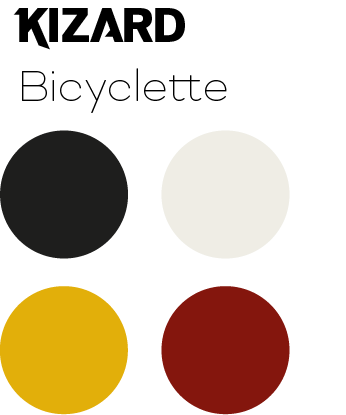
The color palette was inspired by how prominent the New Orleans culture is as well as how bold the colors are frequently used throughout the city and historical sites.
The typeface Kizard is used for the logo and main titles shown in the app. This type was chosen because of it's bold features and sharp marks to contrast well with the logo and other graphics. Bicyclette is used as the body type in paragraphs and harmonizes well with the heavy graphics, logo, and the kizard typeface.
"Autum without the n"
Copyright ©Autum Enright. All Rights Reserved.
