THE SOURDOUGH SOCIETY
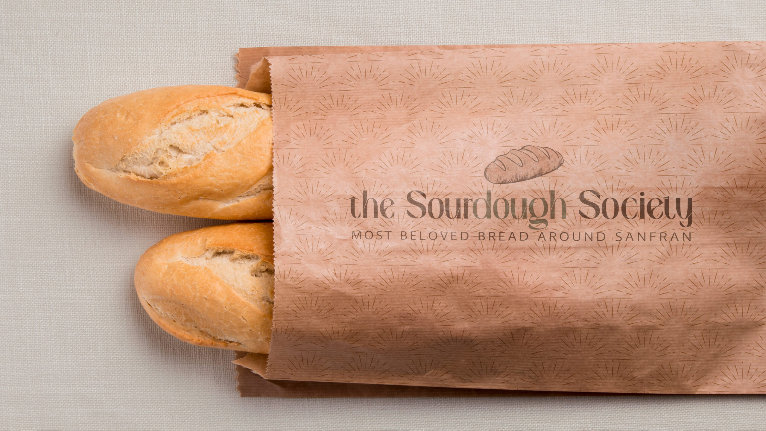
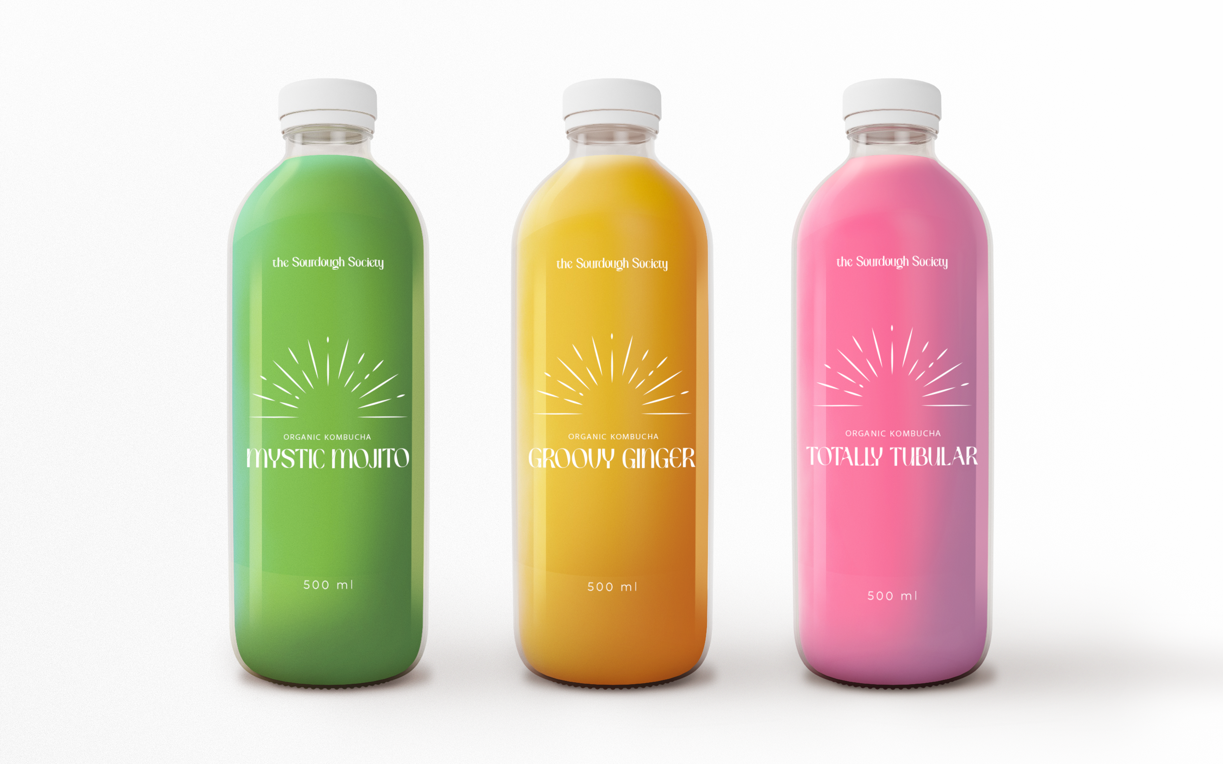
The Sourdough Society, originally "Brioche Cafe and Bakery", needed a rebrand and face lift. They are out of Haight Ashbury in San Francisco where they felt embracing the counterculture of the 1960s was the best way to connect with their community and history. Because of this, they felt keeping that essence throughout their rebranding would be crucial, all the while having it feel a bit more fitting for 2023.
Logo Variations & Color
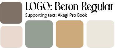
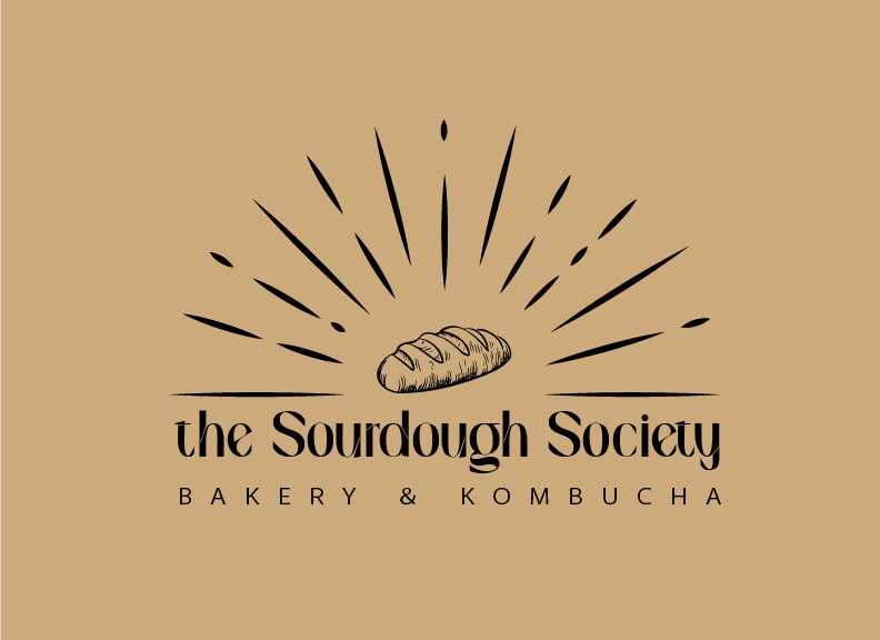
There are 3 Primary colors used throughout the brand system and 2 supportive colors you see to accent and detail certain aspects. The logo's main type gives off a subtle wave or flow to it which hints at the peace and love of the counterculture history while bringing in a beautfiul modern elegance to preseny day. The rough sketch of the sourdough bread in the middle contrasts well with the sun ray marks that are sharp and crisp. Overall, the colors are meant to incorporate a sense of peace and joy while making people feel at home and relaxed during their visit at the bakery.
Welcome In!
Thanks for Visting!
"Autum without the n"
Copyright ©Autum Enright. All Rights Reserved.
