REFRESH REAL ESTATE
Brand Statement & Attributes
Untraditional. Quality. Inviting.
A one stop shop for refreshments & real estate. The place for evryone to enjoy their morning coffee, evening craft cocktails & business. This is a space that eliminates an extra errand, allows for room to build relationships and encapsulates a setting for the many to feel right at home.
Mission & Vision
RR seeks to create real estate opportunities made accessible and approachable for all. We want to reach people of all backgrounds to connect with the community in a new and refreshing way. The untraditional way.
Core Values
Personal Relationships // Functional // Quality Service // Experiences // Sustainability // Approachable // Community Driven
Untraditional. Quality. Inviting.
Brand Elements
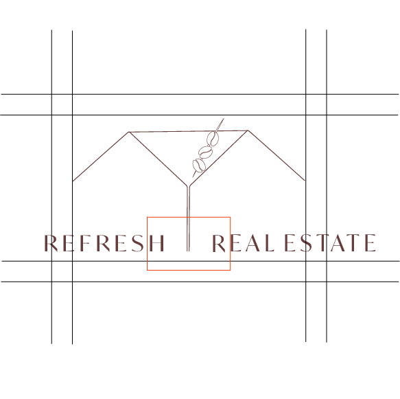
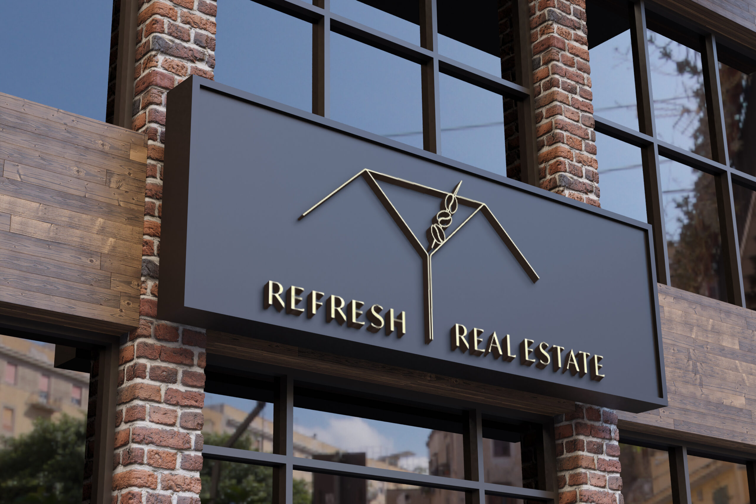
The Logo and marks should always have enough and equal space around. The logo itself is designed to be asymmetrical from the center or stem of the martini glass out. The space from where "Refresh" ends and the space from where "Real" begins, should be equal distance to the martini stem which is shown in red to the left.
Primary Logo & Color Palette
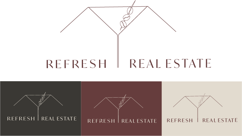
Marks & Icons used

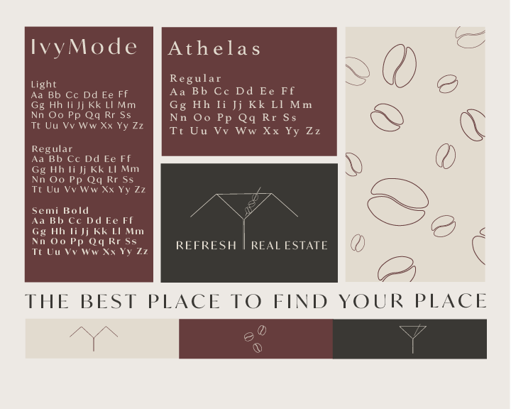
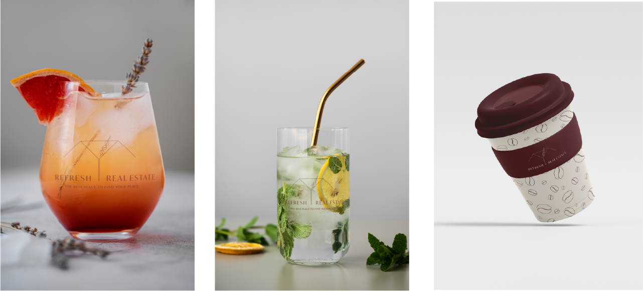
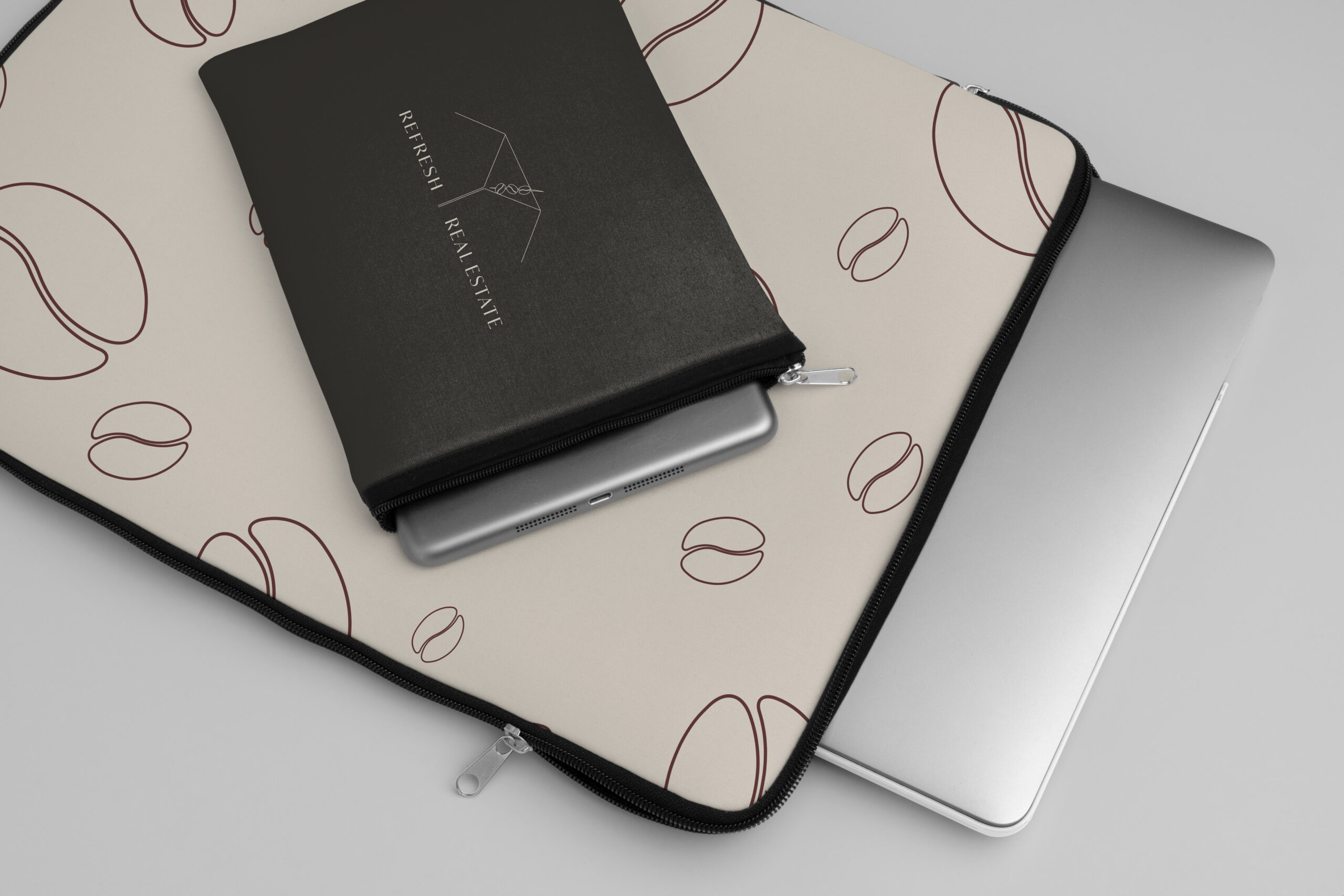
On the right is a pattern used in various materials for the identity and packaging.
The typeface Ivymode is used as the main font throught. The Regular weight is used in the logo and tagline.
Athelas is only used for body text and paragraphs to be more easily readible.
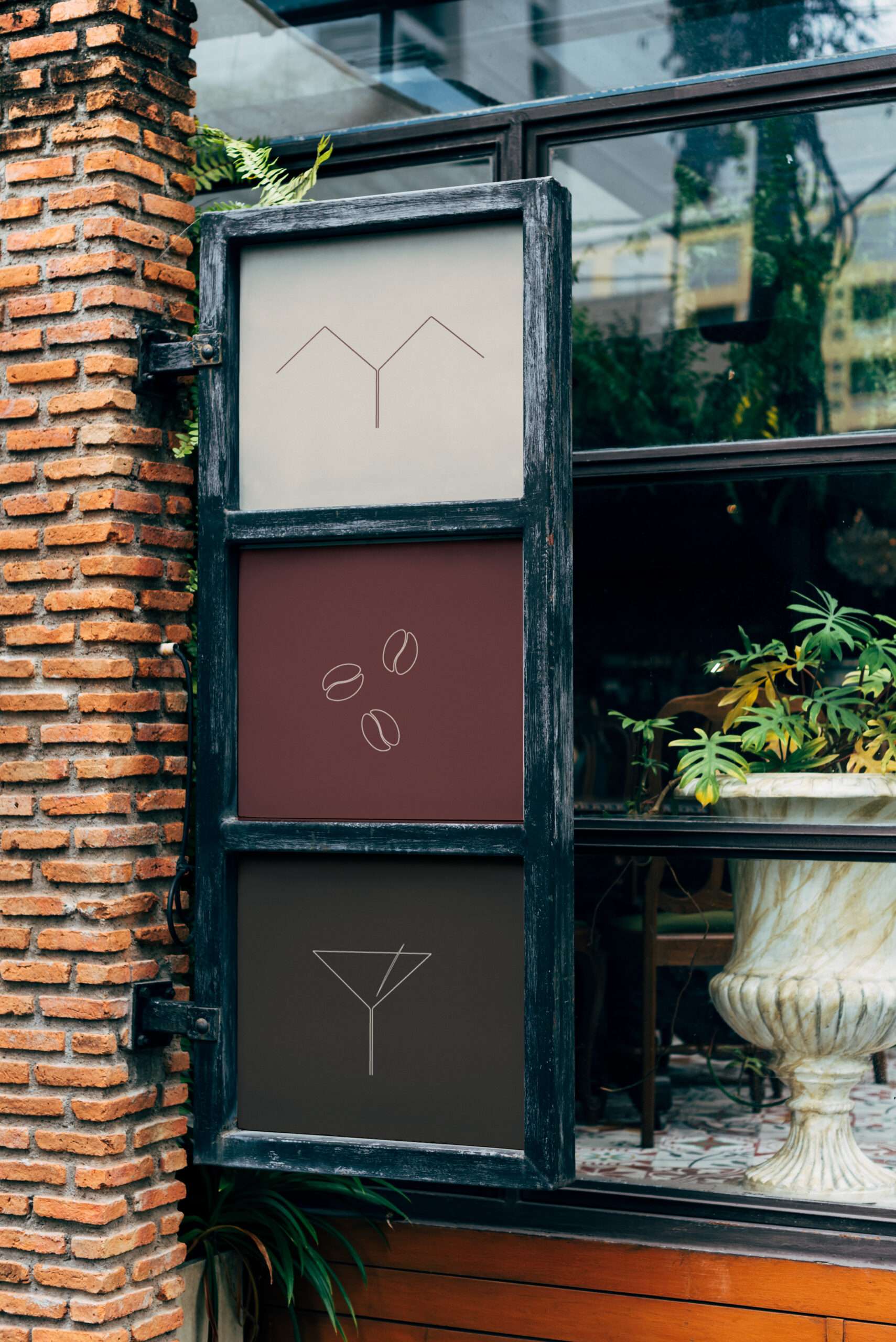
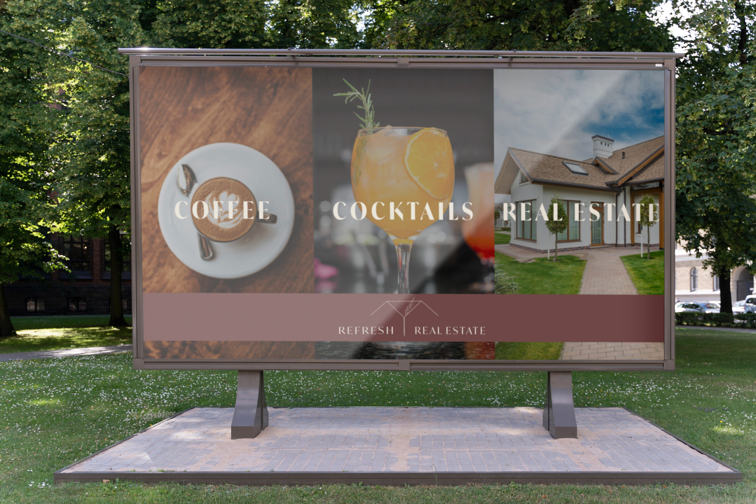
The three icons on the bottom are meant to showcase the Logo broken apart and what services RR offers- Real estate, Coffee, Cocktails.
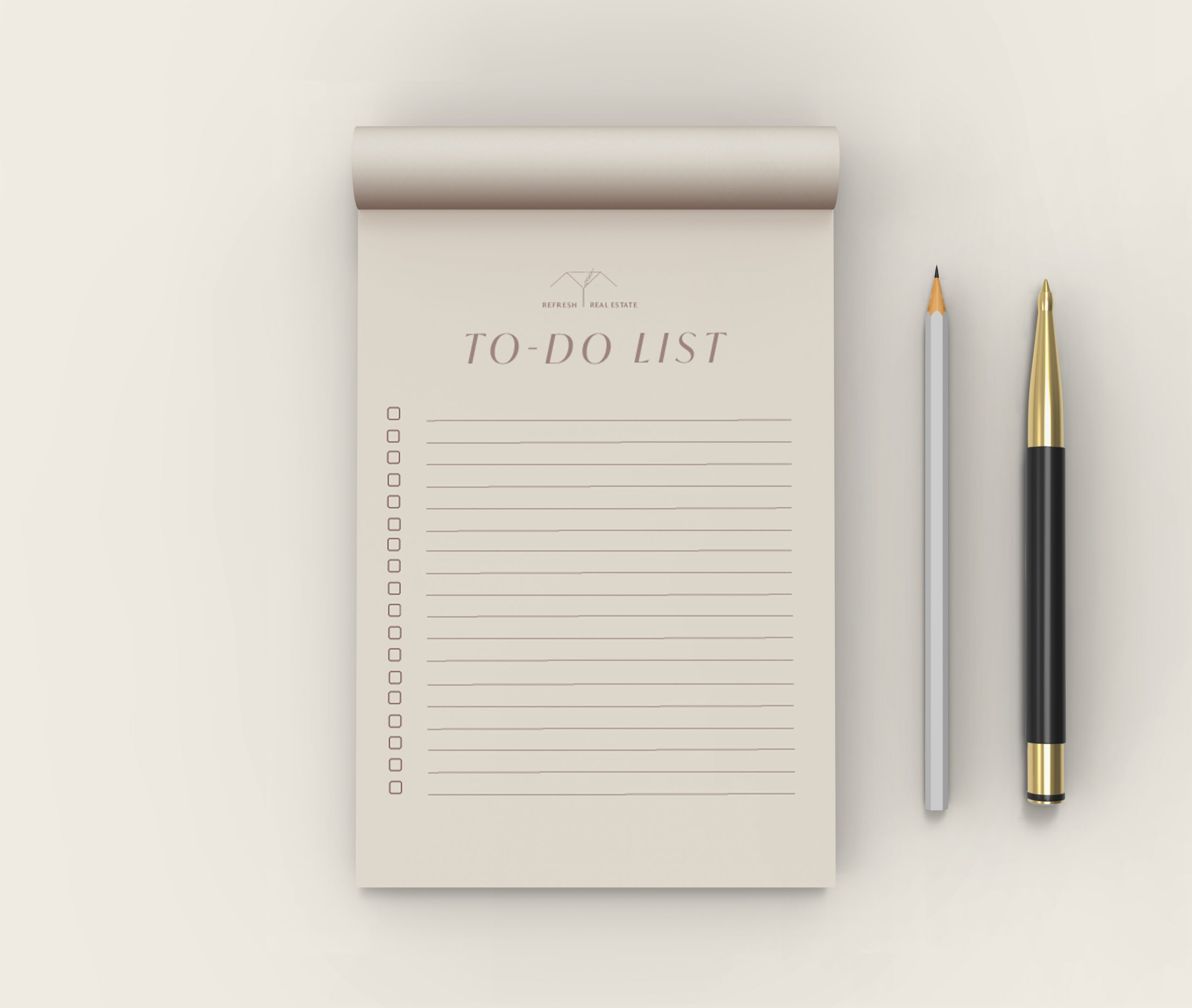
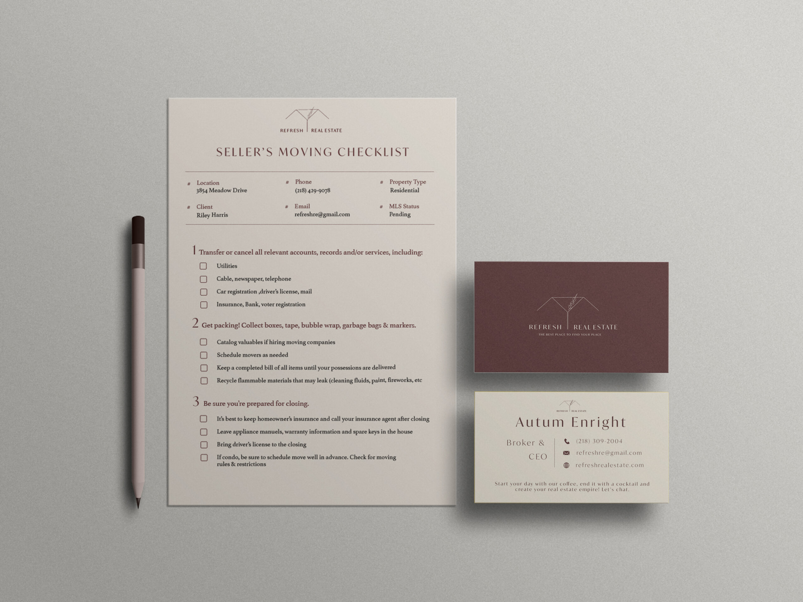
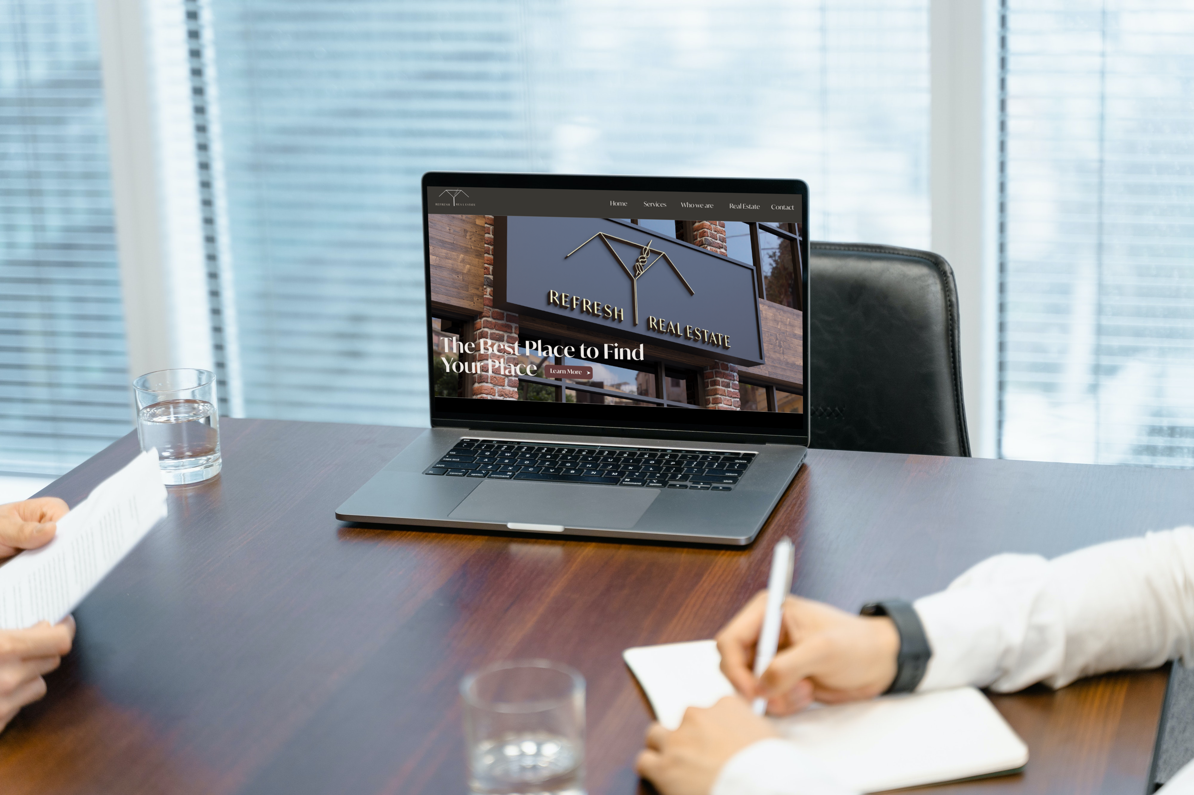
Materials
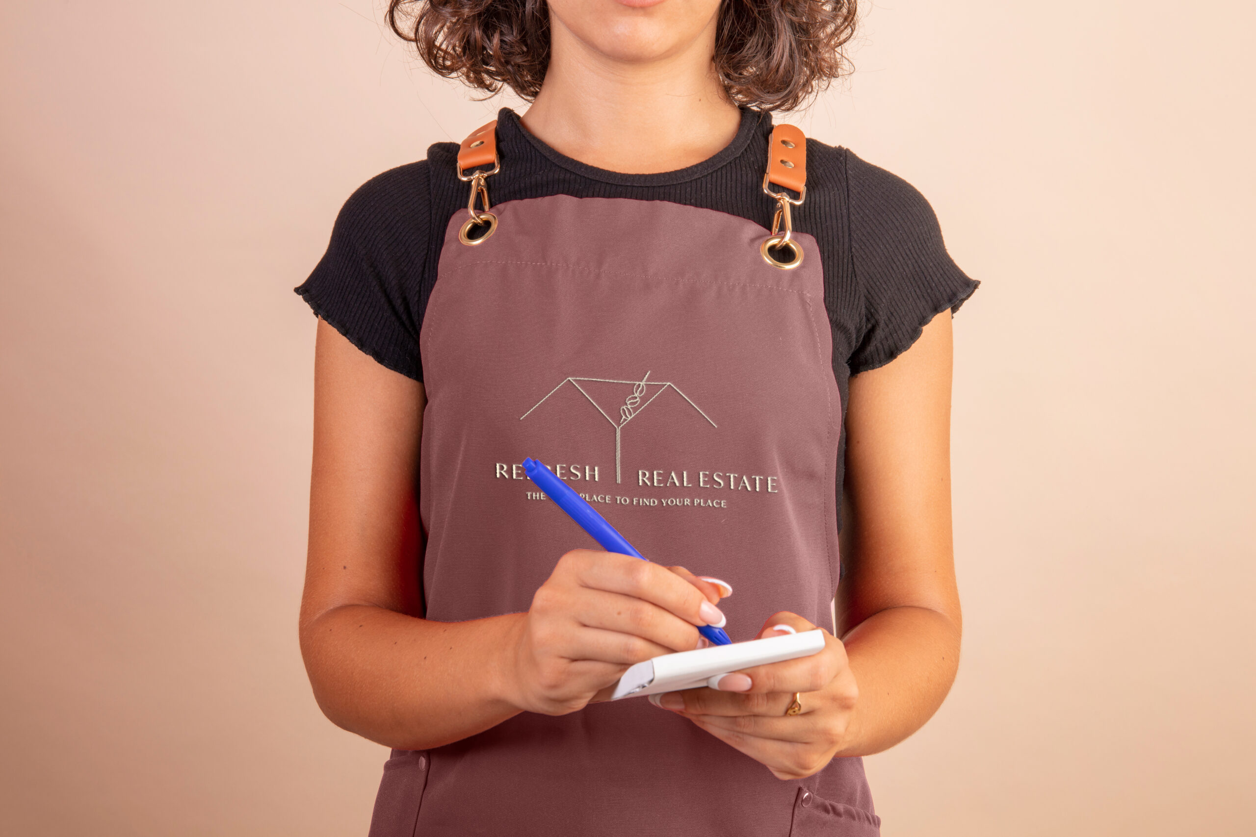
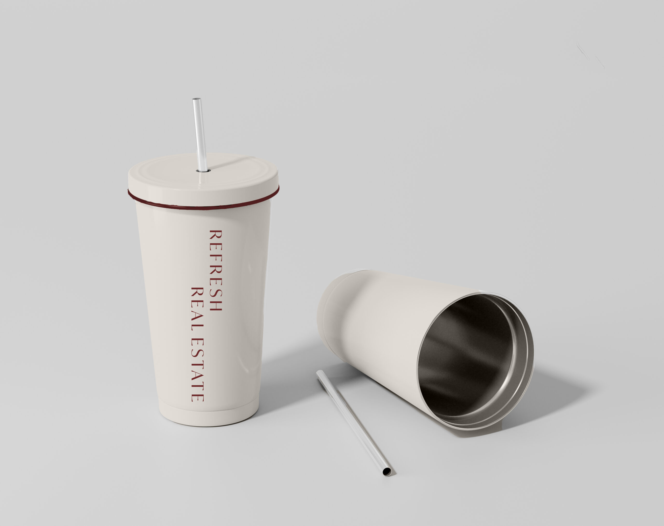
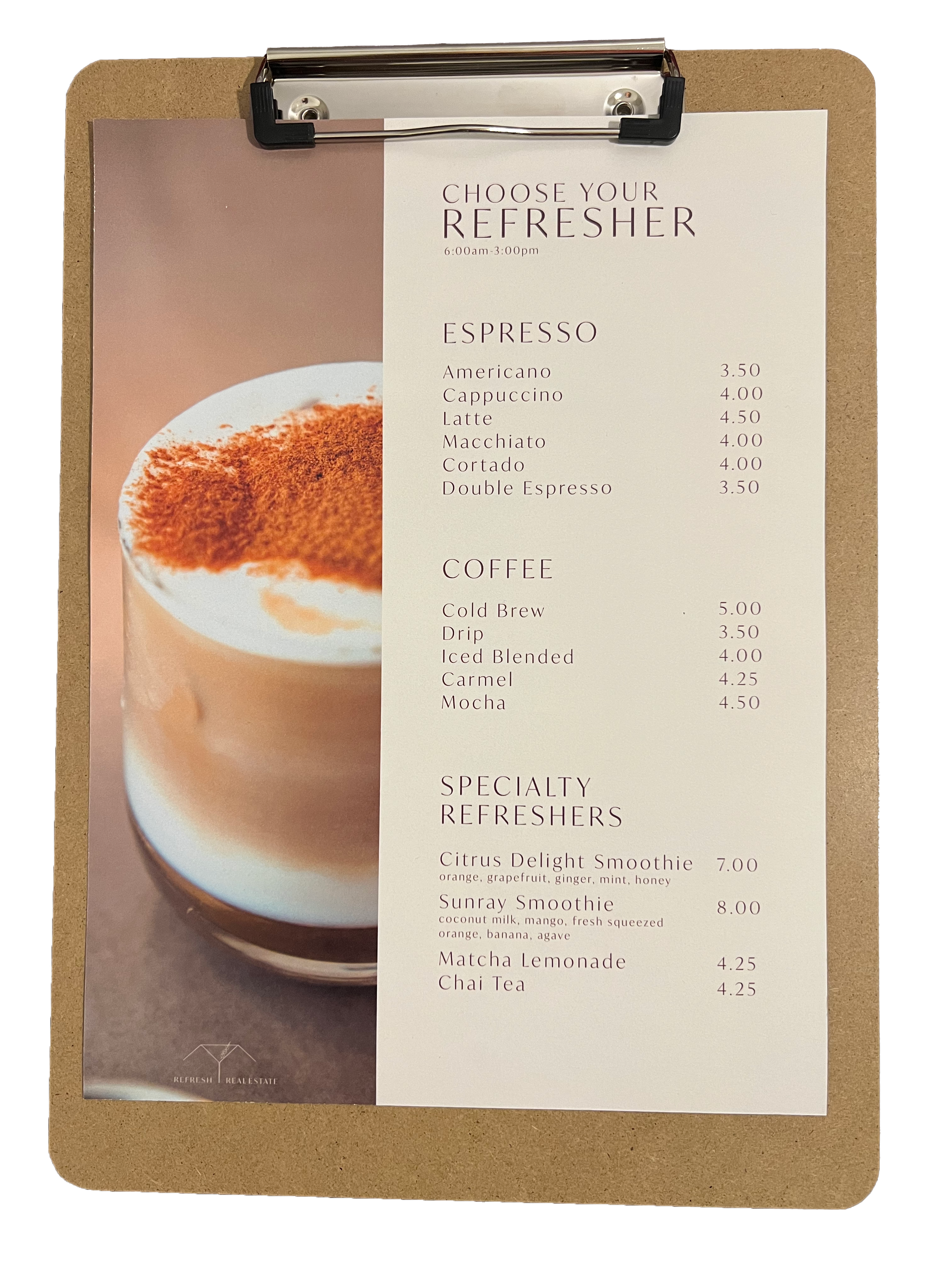
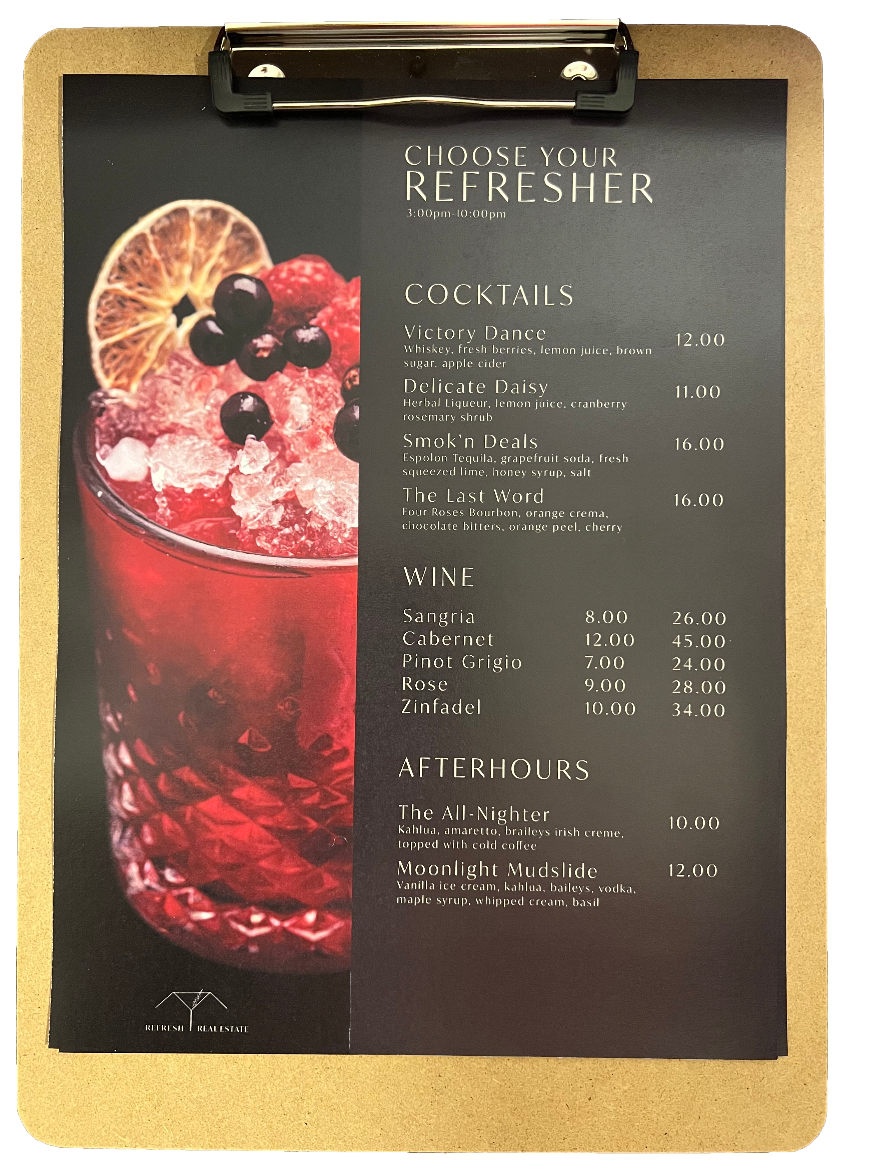
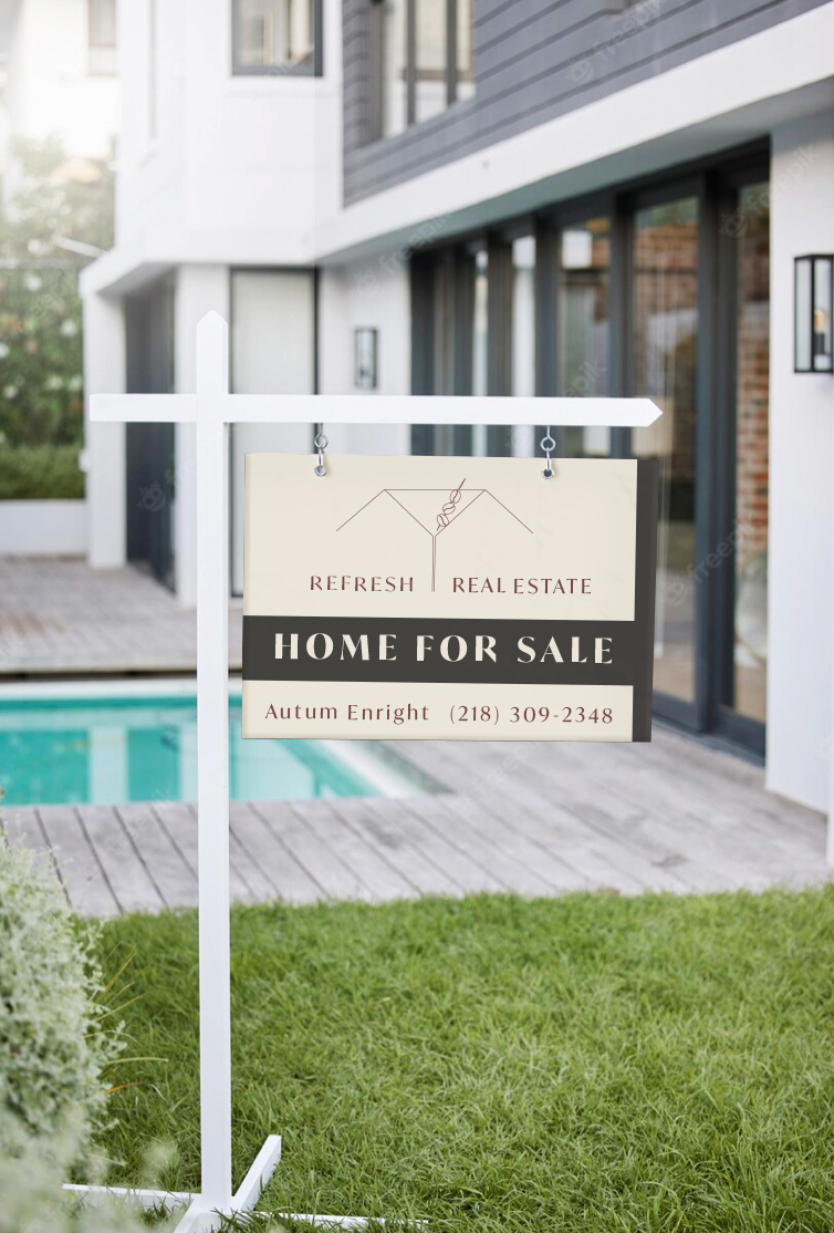
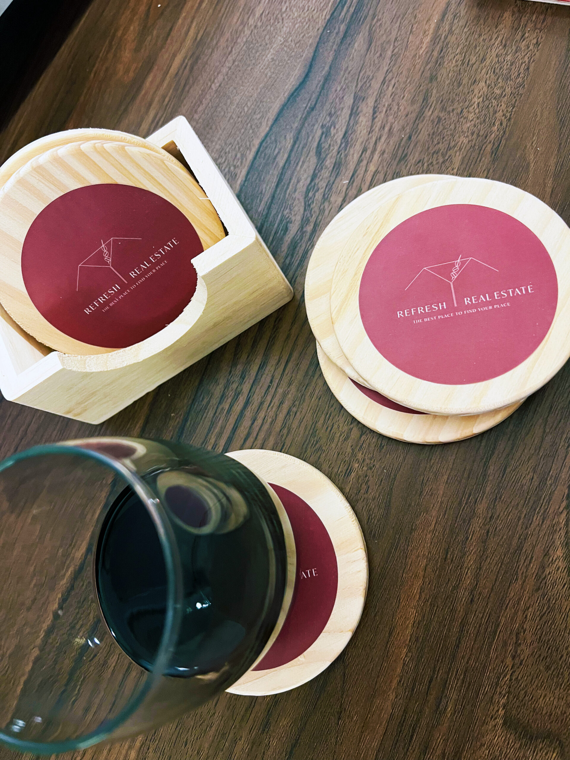
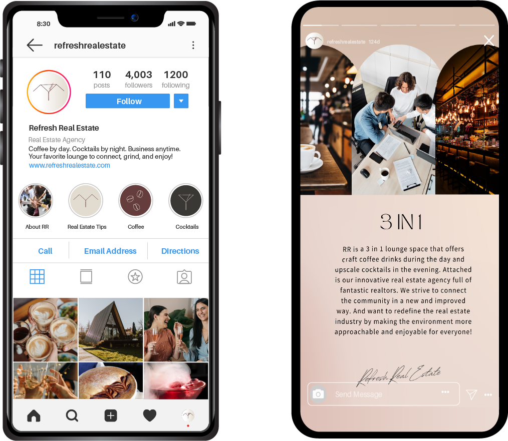
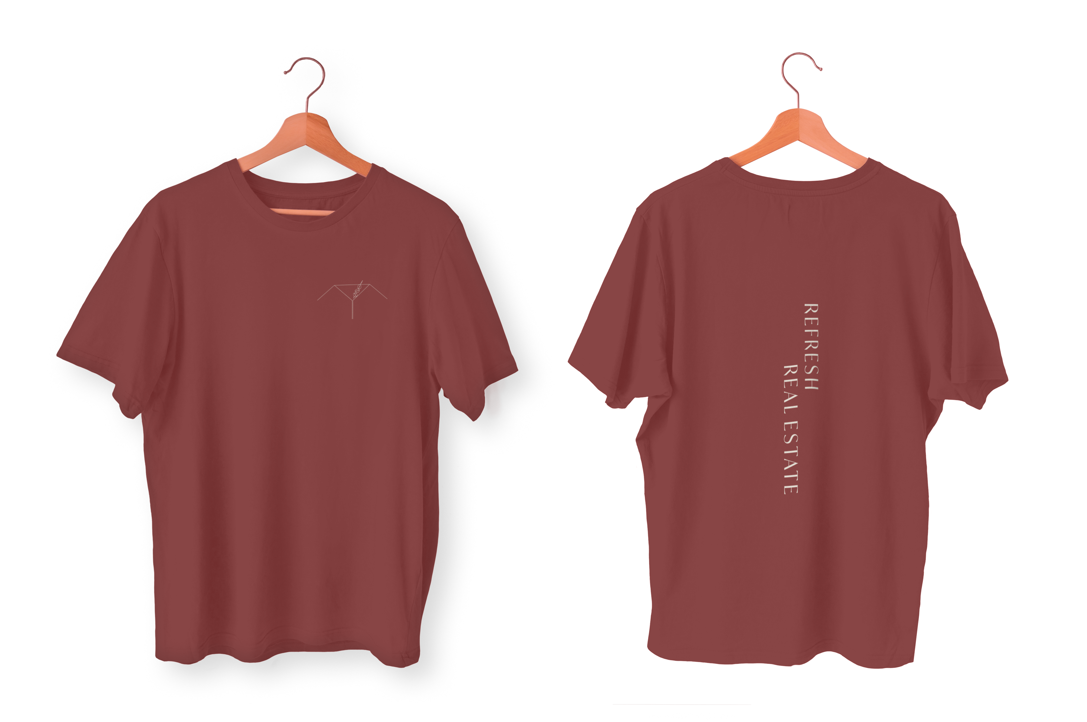
Corporate Social Responsibilty Campaign
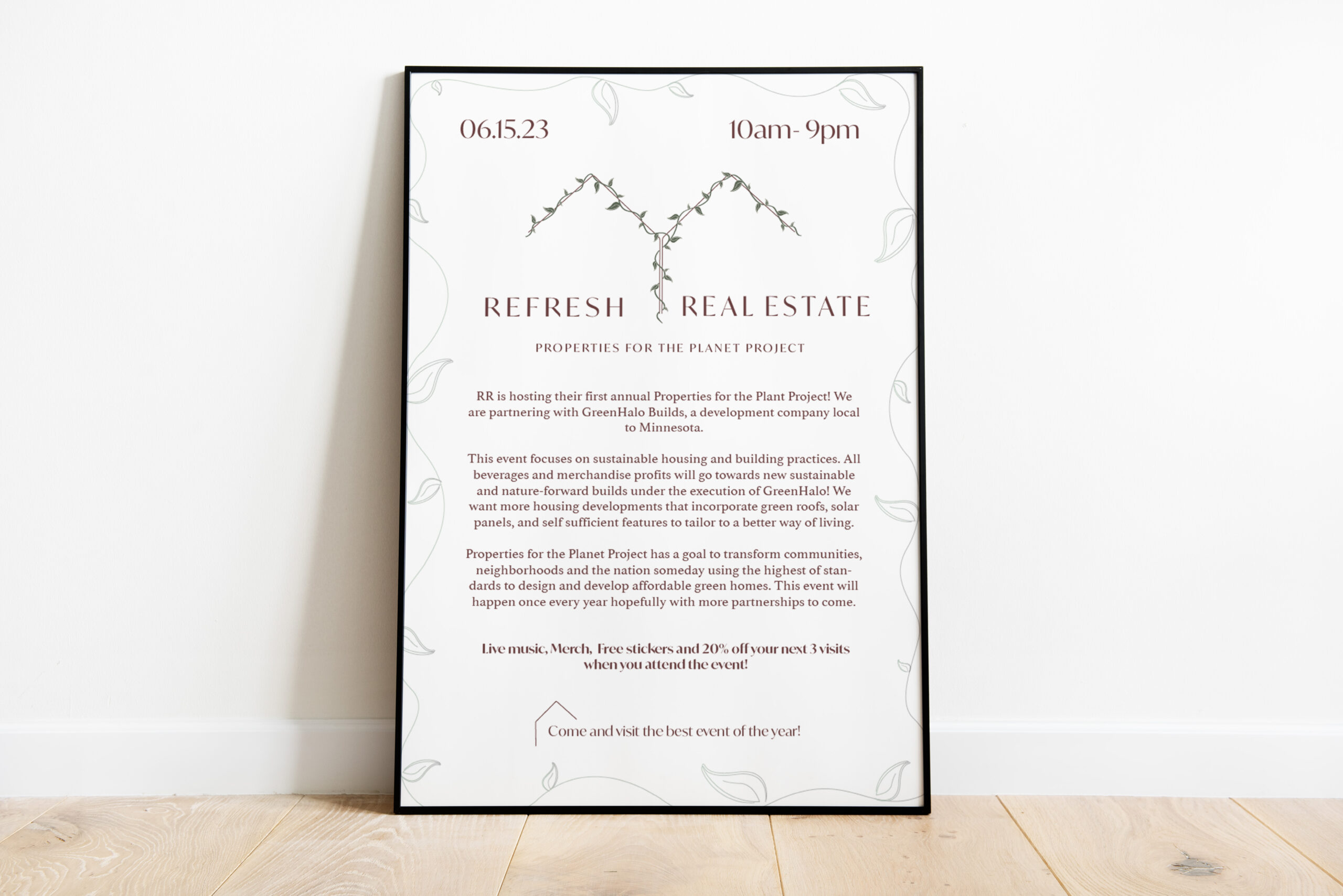
RR is hosting their first annual Properties for the Planet Project and partnering with Green Halo Builds, a sustainable builds development company local to Minnesota. The event focuses on sustainable housing and building practices. All beverages and merchandise profits go towards new nature-forward builds under the execution of GreenHalo!
RR strives to create more housing developments that incorporate green roofs, solar panels, and self sufficient features to tailor to a better way of living. The goal of Properties for the Planet Project is to transform communities, neighborhoods and the nation someday using the highest of standards in design and to develop affordable green homes.
"Autum without the n"
Copyright ©Autum Enright. All Rights Reserved.
